Branding
All Invera products must be designed to follow the Invera look and feel as given by the Vera Design System components, tokens and patterns. In particular each product now has its own logo and can be considered as the major branding element.
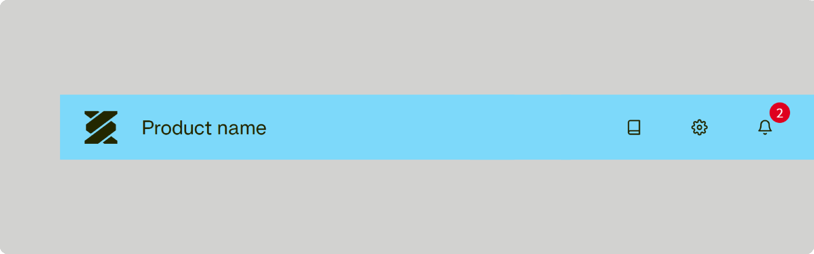
Product logo inside the header#
- When to use
- Use whenever a layout with header is in use.
- Description
- The Invera logo is positioned on the very left of the header as the white logo variant.
Often the logo is combined with the product name on the right of it. - Behaviour
- The logo can also serve as a link to the starting screen of the application.
It should always be visible. For small screens it may be reduced to its icon variant. - Components to use
-
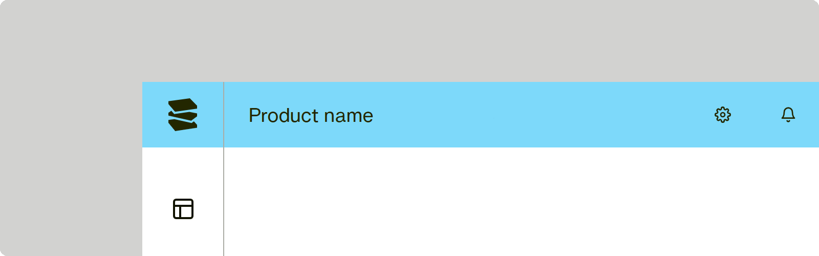
Product logo inside the sidebar#

- When to use
- Use whenever a layout with only a sidebar is in use.
- Description
- The Invera logo is shown in its icon variant. It is positioned on the very left of the header of the sidebar as the white logo variant.
Often the logo is combined with the product name on the right of it. - Behaviour
- The logo can also serve as a link to the starting screen of the application.
It should always be visible. For small screens it may be reduced to its icon variant. - Components to use
-
Product logo inside the collapsed sidebar#
- When to use
- On the collapsed sidebar or on any other occasion where the space is very limited: the icon variant of the logo may be shown.
- Description
- The Invera logo is shown in its icon variant. It is positioned on the very left of the header of the sidebar as the white logo variant.
Often the logo is combined with the product name on the right of it. - Behaviour
- The logo can also serve as a link to the starting screen of the application.
It should always be visible. For small screens it may be reduced to its icon variant. - Components to use
-